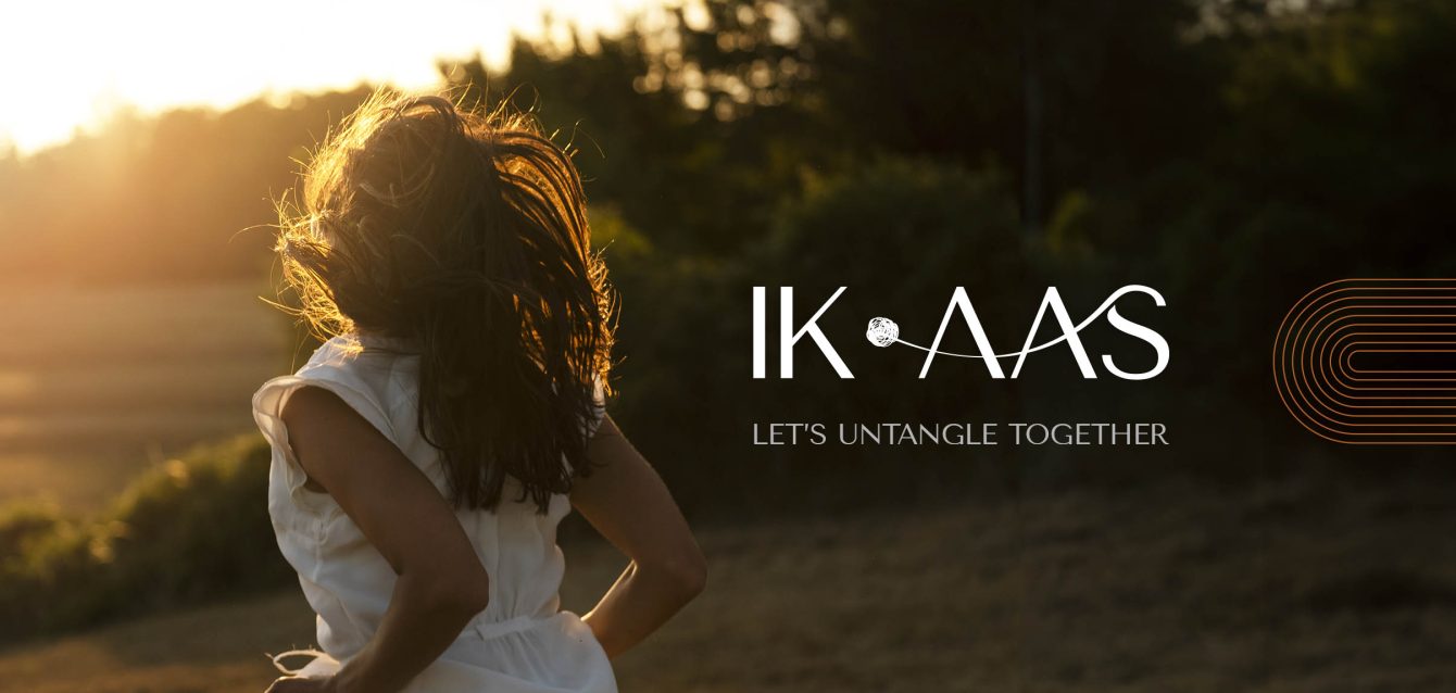
About the brand
Ik Aas, which means A Hope in Punjabi, was created to support the mental well-being of the South Asian community in the United States. For many in this community, talking about mental health can feel difficult — sometimes even impossible. Stigma, cultural expectations, and a lack of familiar resources often leave people feeling isolated.
Ik Aas was born out of a need to change that. By offering therapy and support in a way that feels warm, relatable, and culturally understanding, Ik Aas helps people feel safe enough to open up, seek help, and find hope.
The challenge
Create a distinctive brand identity and social media presence that sets Ik Aas apart from traditional therapy practices. The goal was to visually communicate the meaning of ‘Ik Aas’ — a hope — in a way that feels warm, inviting, and emotionally resonant, fostering a sense of connection with potential clients. The project scope included designing the logo, color palette, typography, and visual language, along with creating impactful social media content to build brand awareness and engagement.
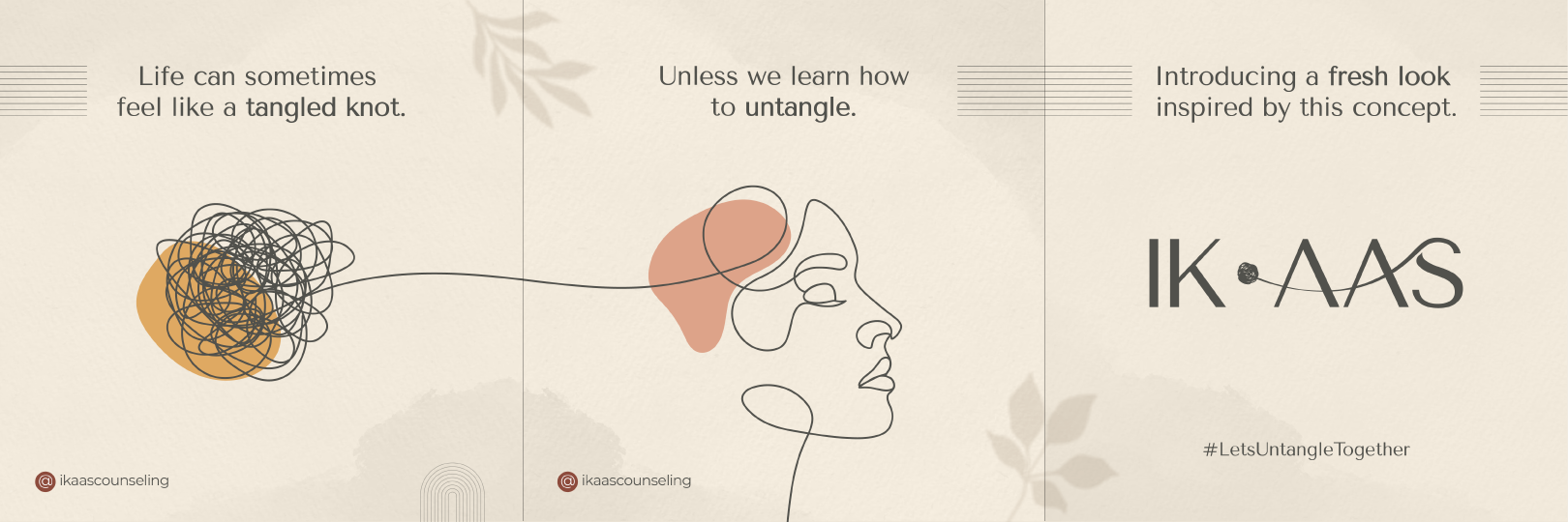
Logo idea

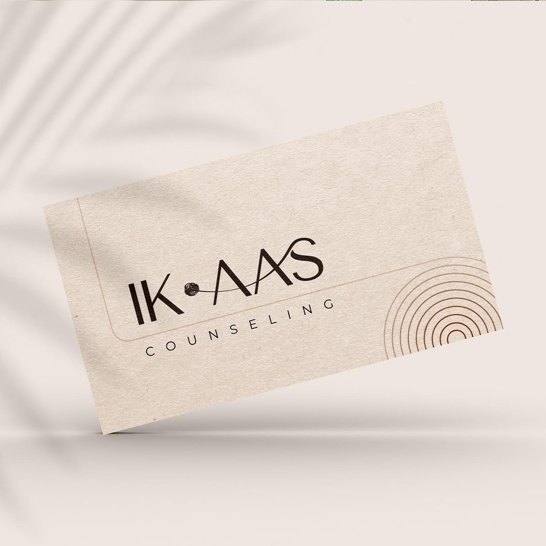
The logo design captures the essence of a therapeutic journey, where the intricate pathways of the mind untangle, revealing a path towards improved mental health. The logo features complex, tangled lines at the center, symbolizing challenges in mental health. These lines untangle into a single line in the ‘AAS’ part of the logo, emphasizing on the meaning ‘ONE HOPE.’ As threads of confusion and distress unravel, they pave the way for a clearer, healthier state of mind.
The design remains simple, ensuring readability in both digital & print formats.
Color Palette
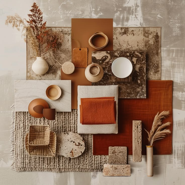
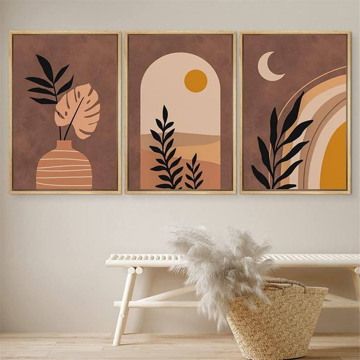
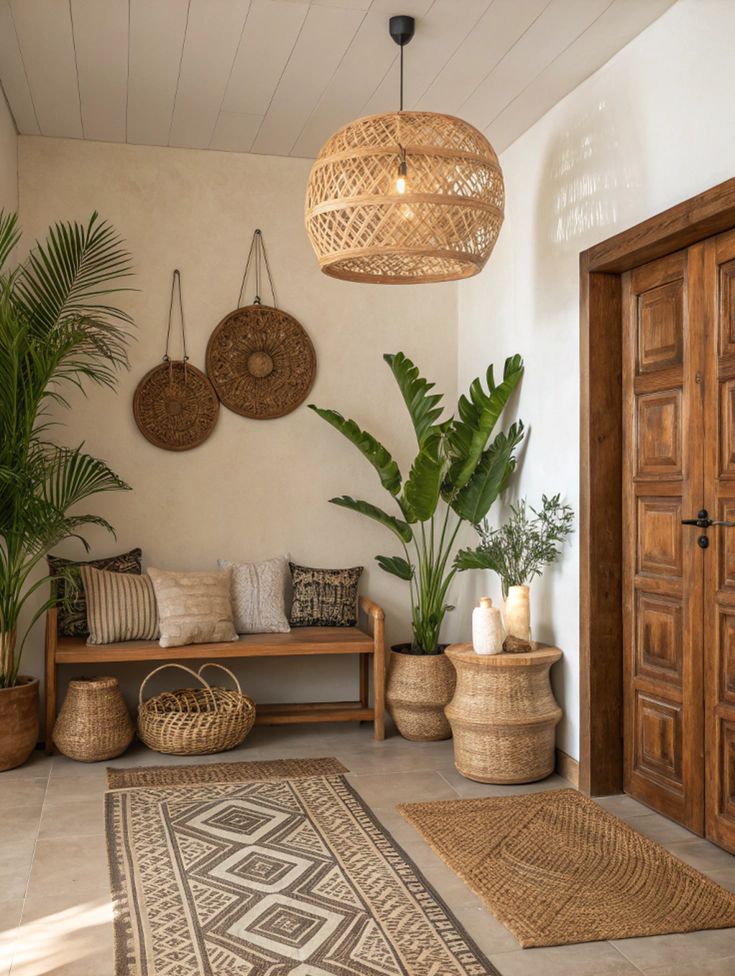

The Ik Aas color palette draws inspiration from boho homes, which are known for their warm, cozy, and inviting feel. The colors in these spaces are often soft and natural, like the shades you’d see in wooden furniture, woven fabrics, or sunlit walls. They’re gentle yet rich, creating a sense of comfort and calm. This mix of warm tones and earthy shades makes boho spaces feel relaxed, welcoming, and full of character.
- Linen: A soft, neutral base that feels calm and inviting, creating a sense of safety and openness.
- Blush: A gentle, comforting pink that adds warmth and softness.
- Rose: A deeper, richer red tone that symbolizes strength, courage, and emotional depth.
- Mint: A soothing green that brings balance and a sense of calm — ideal for reinforcing peace.
- Yolk: A warm, golden hue that represents hope, positivity, and new beginnings.
- Earth: A grounding brown that reflects stability, resilience, and connection to one’s roots.
- Jet: A deep charcoal that adds contrast, ensuring the softer colors stand out.
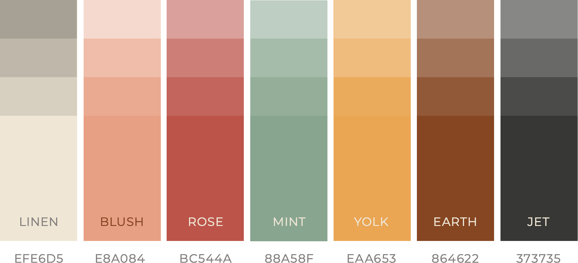
The strategic use of light and dark tones enhances contrast, improving readability and guiding the viewer’s eye across designs. The softer hues like Linen and Blush create a sense of openness and calm, while deeper tones like Earth and Jet add grounding and strength. This balance ensures the brand feels gentle yet confident — soothing yet empowering.
By blending these colors, Ik Aas visually feels peaceful yet uplifting, much like stepping into a comforting boho-inspired home — a space where you feel calm, peaceful, and hopeful.
Design Elements
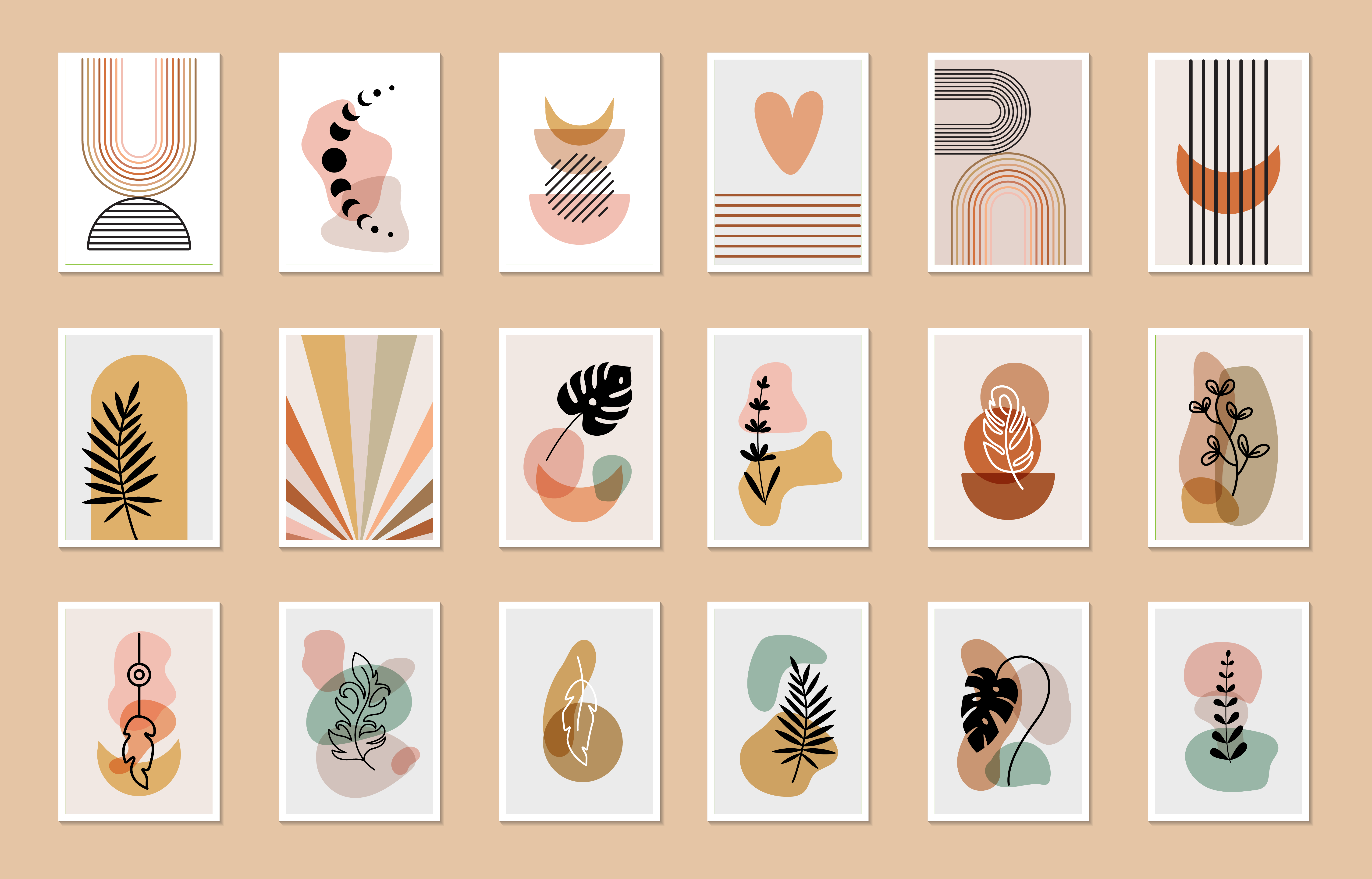
The Ik Aas design blends simple shapes, hand-drawn details, and flowy patterns to create a relaxed look. This mix suggests balance — making the brand friendly rather than clinical. Adding to this are the soft, imperfect lines which add a human touch, while the organised structure of organic shapes give symmetry to the overall look. Together, these elements create a sense of comfort and hope — just what Ik Aas stands for.
Typography

The Ik Aas branding uses Tenor Sans as the primary typeface for headlines and Montserrat for body text. Together, these fonts create a balance of elegance, clarity, and warmth.
- Tenor Sans has a clean, refined look with subtle character, giving headlines a gentle yet confident presence. Its graceful letterforms add a sense of hope and resilience, aligning with the brand’s message.
- Montserrat, with its modern and highly readable design, ensures content feels clear, approachable, and easy to understand — especially important for communicating mental health support.
The combination of these two typefaces strikes the right balance: Tenor Sans adds a touch of softness and care, while Montserrat keeps the messaging concise and accessible.
Photography
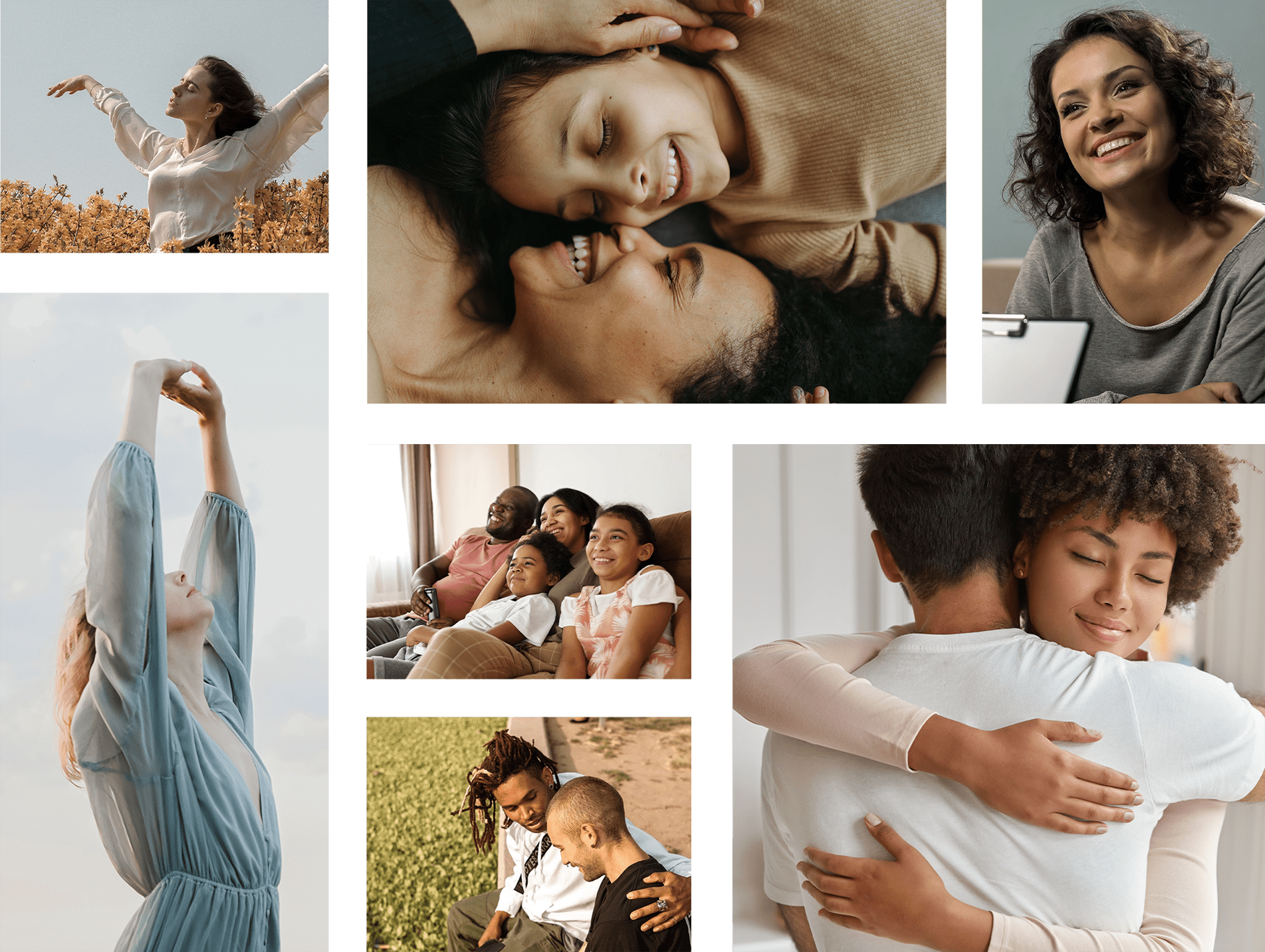
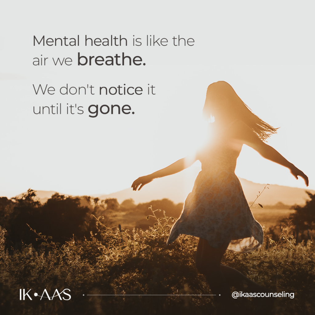
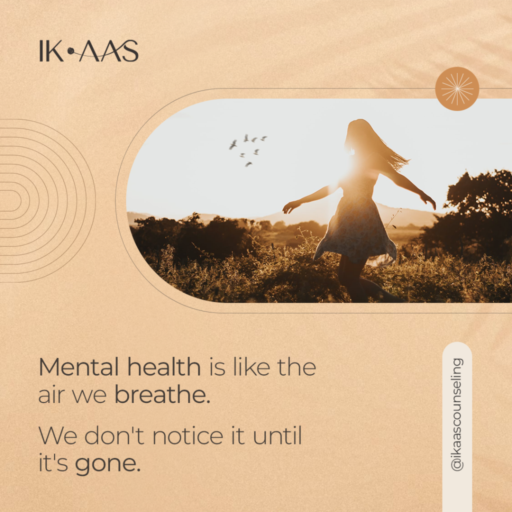
The photography style for Ik Aas is designed to feel authentic, calming, and supportive — capturing moments that feel real and relatable. The images focus on candid shots of people in everyday settings, often engaged in quiet reflection or comforting interactions.
By intentionally avoiding direct eye contact, the visuals feel less confrontational and more inviting, allowing viewers to observe and connect without pressure. This approach creates a sense reassurance — as if the viewer is witnessing a peaceful moment from afar.
The overall tone is warm and optimistic, reinforcing the message that healing is possible and hope is always within reach. This thoughtful photography style helps Ik Aas feel like a soothing presence — one that understands, supports, and uplifts.
Printables
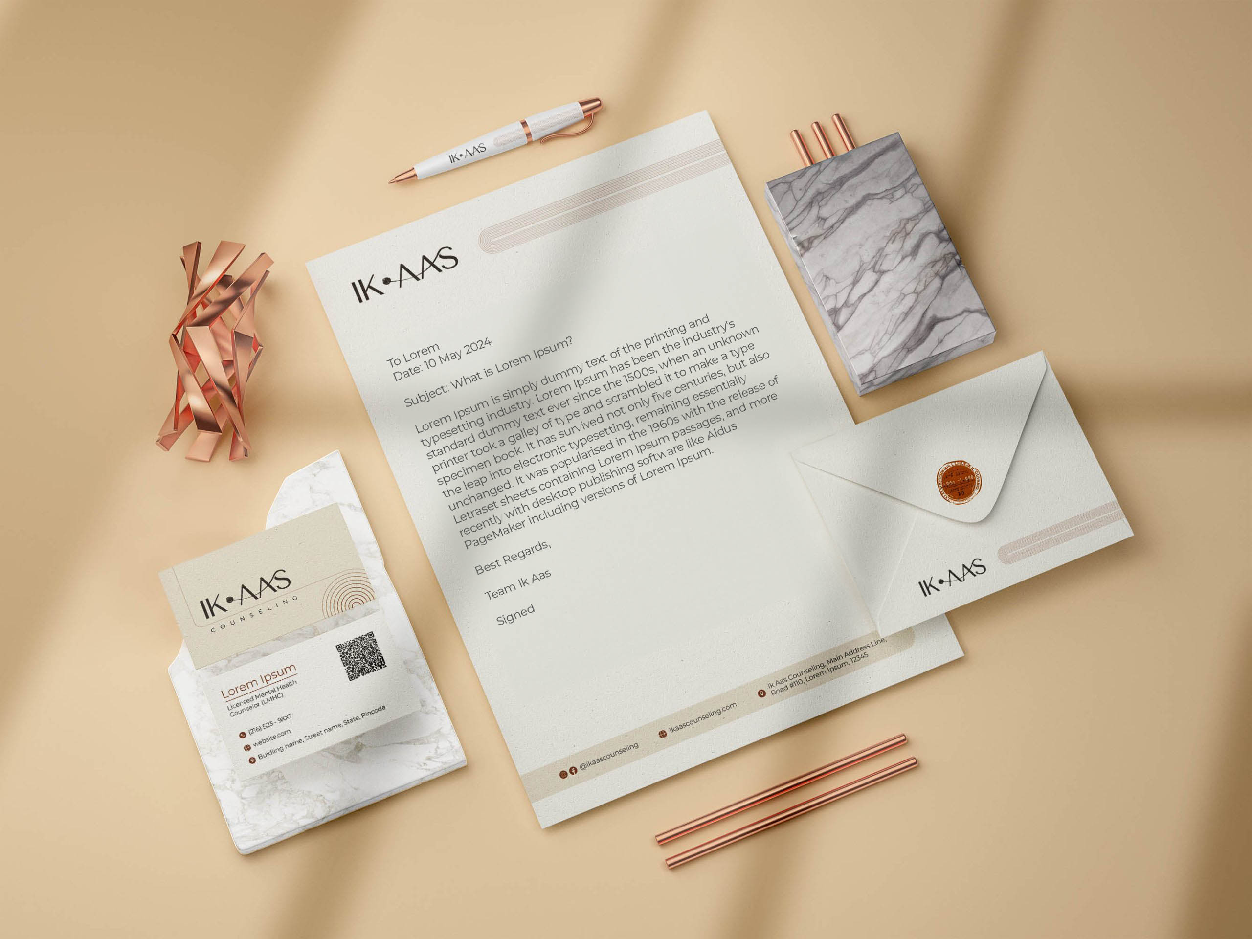
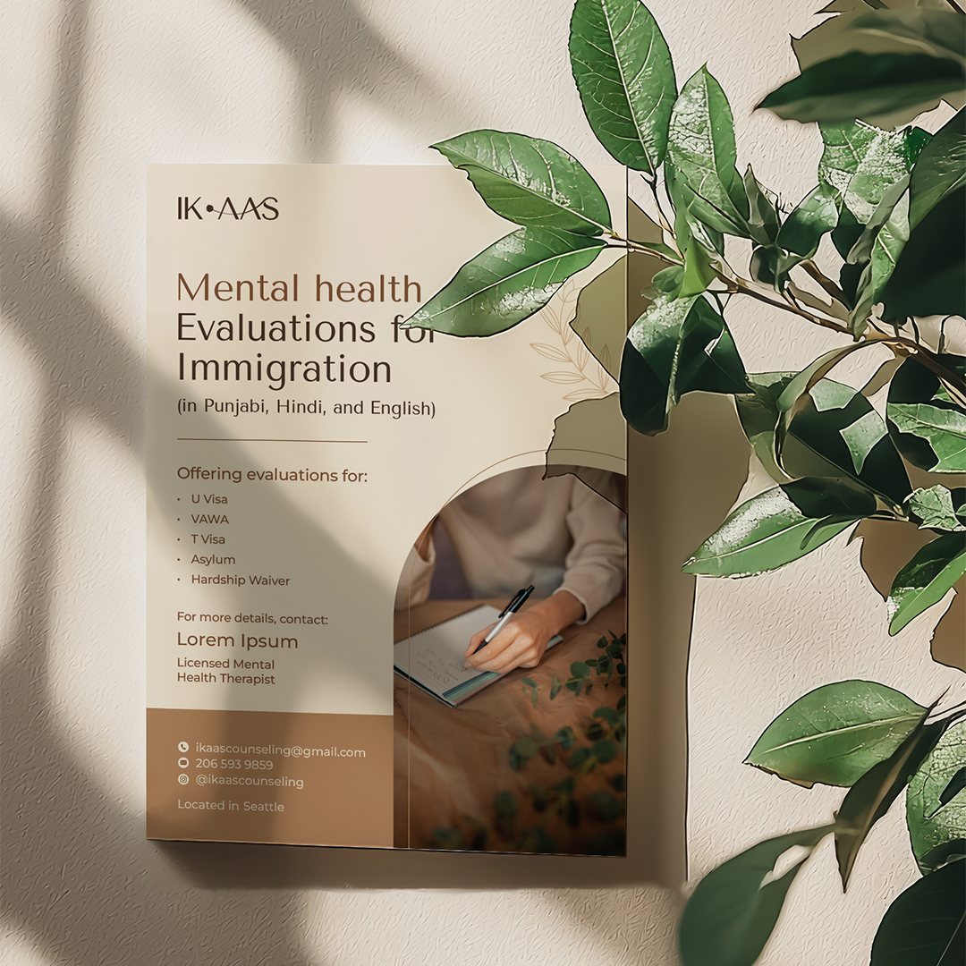
The visiting cards, letterhead and other stationary for Ik Aas carry forward the brand’s core concept — the journey from struggle to clarity. Inspired by the logo’s design, these print materials feature untangled lines that flow seamlessly, symbolising the process of finding peace and meaning.
The lines start off slightly chaotic but gradually become more structured and clear, reflecting how therapy can bring order to overwhelming chaos of one’s thoughts. This subtle yet meaningful detail reinforces Ik Aas‘ message — that with the right support, hope and clarity can emerge from confusion.
Social Media
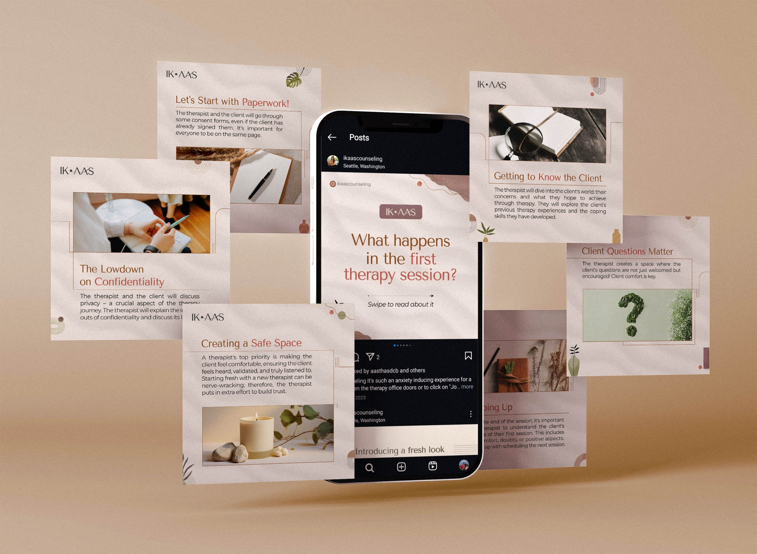
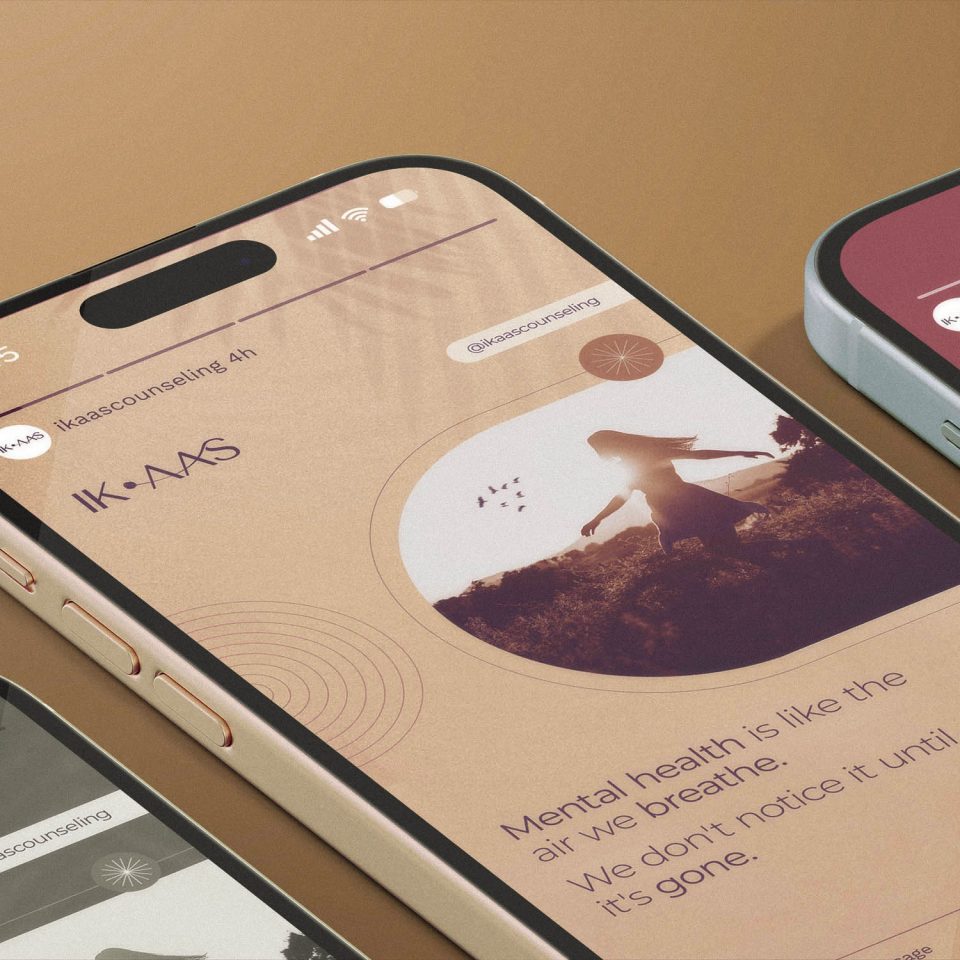
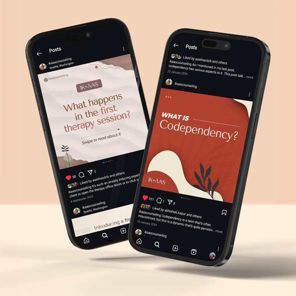
The Ik Aas Instagram page was designed to feel like a safe, uplifting space — a place where people can pause, reflect, and feel supported. The visual style mirrors the brand’s calming aesthetic, using soft colors, flowy shapes, and warm tones to create a soothing experience for viewers.
The content strategy focuses on offering value while building trust. Posts combine:
- Gentle reminders and motivational quotes to inspire hope and resilience.
- Educational content that simplifies mental health topics, breaking down complex ideas in a clear and approachable way.
- Self-care tips and mindfulness practices to encourage positive habits.
- Stories and reflections that feel personal and relatable, helping people feel less alone in their struggles.
The overall tone is calm, kind, and reassuring — avoiding overwhelming information or forceful messaging. Instead, the focus is on gentle guidance, empowering people to take small steps toward better mental well-being.
At its heart, IK AAS is about creating comfort — a brand that feels like a warm conversation or a quiet moment of calm. Every design choice, from the untangled lines to the soft colors and candid visuals, reflects this idea. It’s not just about looking good; it’s about making people feel safe, understood, and hopeful. By blending simplicity with meaning, Ik Aas quietly reassures people that healing is possible — one gentle step at a time.
Anshul Kapur (from my notes)


