
Background Story
In my city, there’s an old restaurant that has built a reputation for serving spiced cola—a unique, flavorful twist on a classic soda. On a recent visit, I ordered the drink and found myself wondering: What if Pepsi officially launched a flavor like this?
Considering how intense Indian summers can be, a refreshing yet spicy cola could be a game-changer. The idea of Pepsi Summer Spice started taking shape in my mind:
How would the packaging look?
How would they visually communicate the bold, masala taste?
How could this concept seamlessly fit within Pepsi’s global brand language while embracing local influences?
Accepting this challenge, I went straight to the drawing board to bring this hypothetical flavor to life.
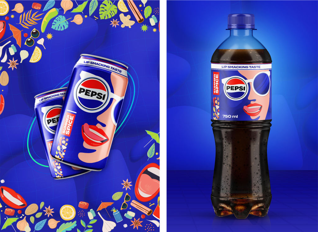
Can and Bottle Design
The design had to capture the essence of a spiced drink—bold, fun, and full of character. Every element was carefully crafted to tell the story of an intense, flavorful experience:
Illustration: At the heart of the design is a striking illustration of a girl with her tongue out, exaggerating the sensation of a taste explosion.
Pepsi-Branded Shades: To add a playful, street-culture vibe, she’s wearing sunglasses—with the Pepsi logo reflected in one lens—symbolizing Pepsi’s unmistakable brand presence.
Spice Band: A set of illustrated spices—key ingredients in masala cola—runs alongside the product name, reinforcing the flavor story. These spices also appear as background elements across various designs for visual consistency.
Background Texture: A stylized cola bubble design in the backdrop adds movement and effervescence, subtly linking back to Pepsi’s core identity.
The result? A can and bottle that don’t just hold a drink, but tell a story—one of refreshment, heat, and an unforgettable sip.
Typography
The branding uses Termina, Pepsi’s official typeface:
Bold & Geometric: Its thick, structured strokes convey confidence and energy.
Old-School Meets Contemporary: The compact letterforms nod to vintage soda branding while feeling modern and punchy.
High Readability: Whether on a can, poster, or hoodie, the typography ensures clarity and impact, making “Summer Spice” instantly recognizable.
By pairing this strong typographic identity with vibrant visuals, the Pepsi Summer Spice branding stands out as loud, youthful, and unmistakably bold.
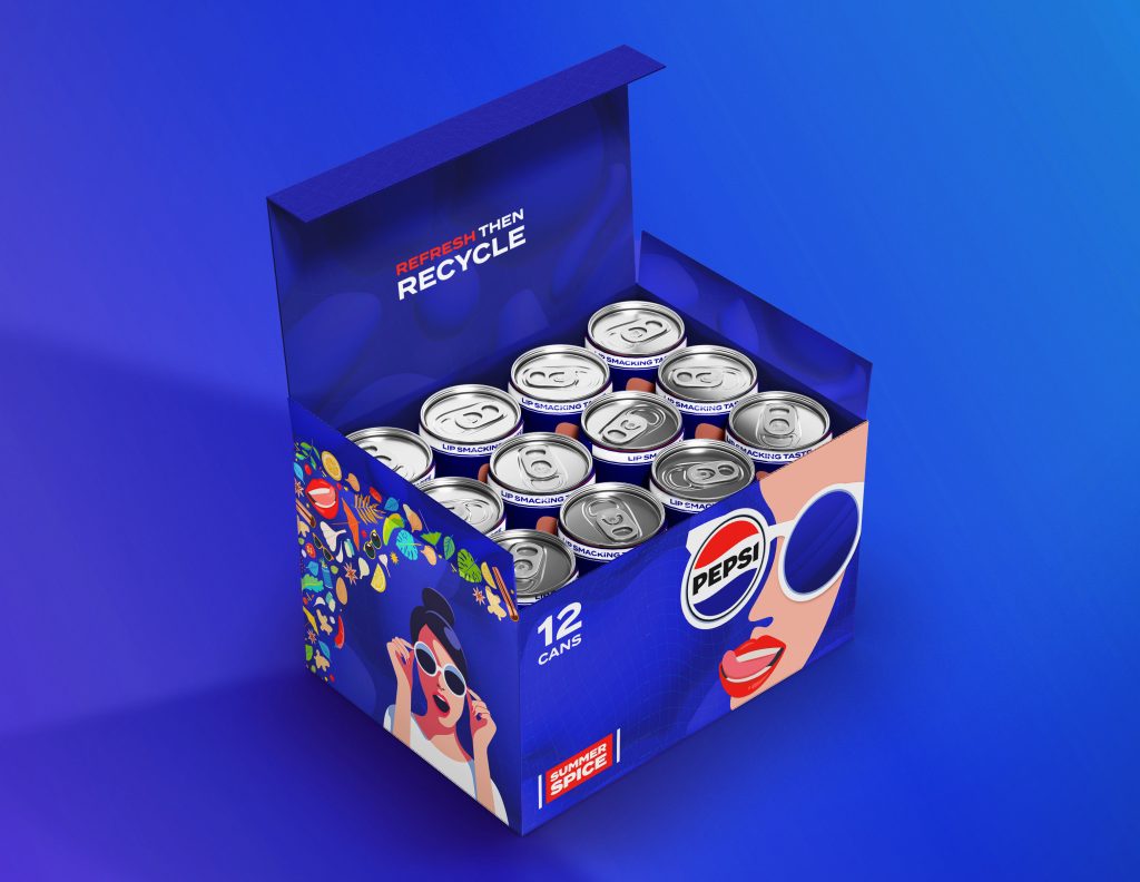
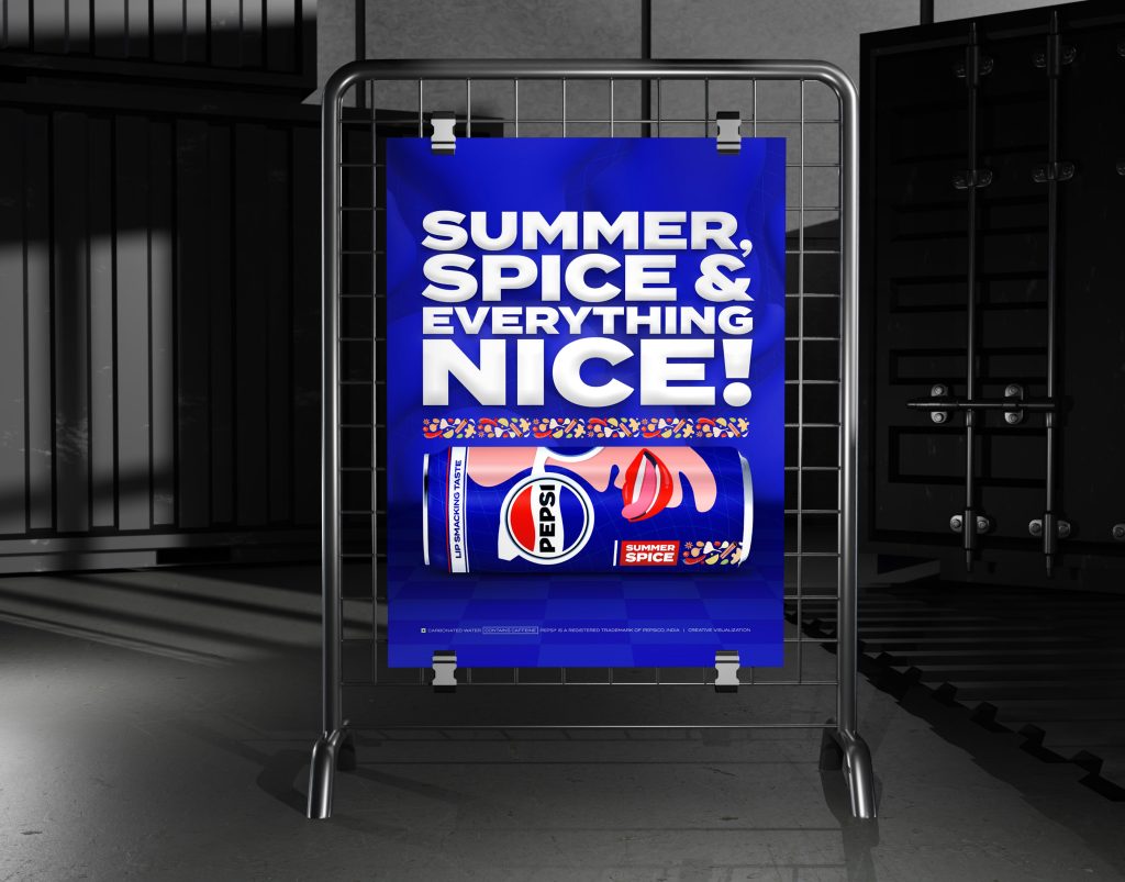
Application Across Deliverables
Cans & Packaging: The design is scalable and has been adapted across 2 can sizes, bottle label and can box packaging.
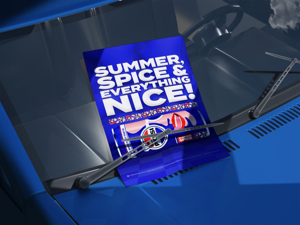
Posters & Flyers: The designs focus to show high-energy, leveraging Pepsi’s signature advertising style—dynamic and youth-driven.
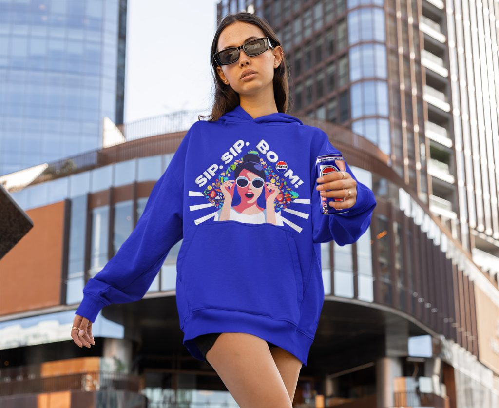
Merch (Hoodies & T-Shirts): Extends the brand beyond the product, turning it into a lifestyle statement.
Conclusion
Pepsi Summer Spice is more than just a hypothetical flavor—it’s an exploration of how a global brand can embrace local culture in a way that feels fresh, exciting, and relevant. This project was a deep dive into visual storytelling, turning taste into design and packaging an experience, not just a product. From the bold illustration to the spiced-up details, every element was crafted to make Summer Spice feel as if it truly belonged on store shelves. While this concept remains unofficial, it serves as a creative exercise in branding, strategy, and cultural fusion, proving that sometimes, the best ideas come from the most unexpected places—like a small restaurant with a legendary spiced cola.